
LOLIPUFF
“Cute is an infantilizing fixation that seeks to exploit the perverse.”.
ELISAVA PROJECT | JULY ‘24
Lorena Ceresoli — Art Director + Graphic Designer Eva Icardo — Art Director Maria Touloupa — Art Director + Editor Pictures Arushi Nayar — Art Director + Photographer


-
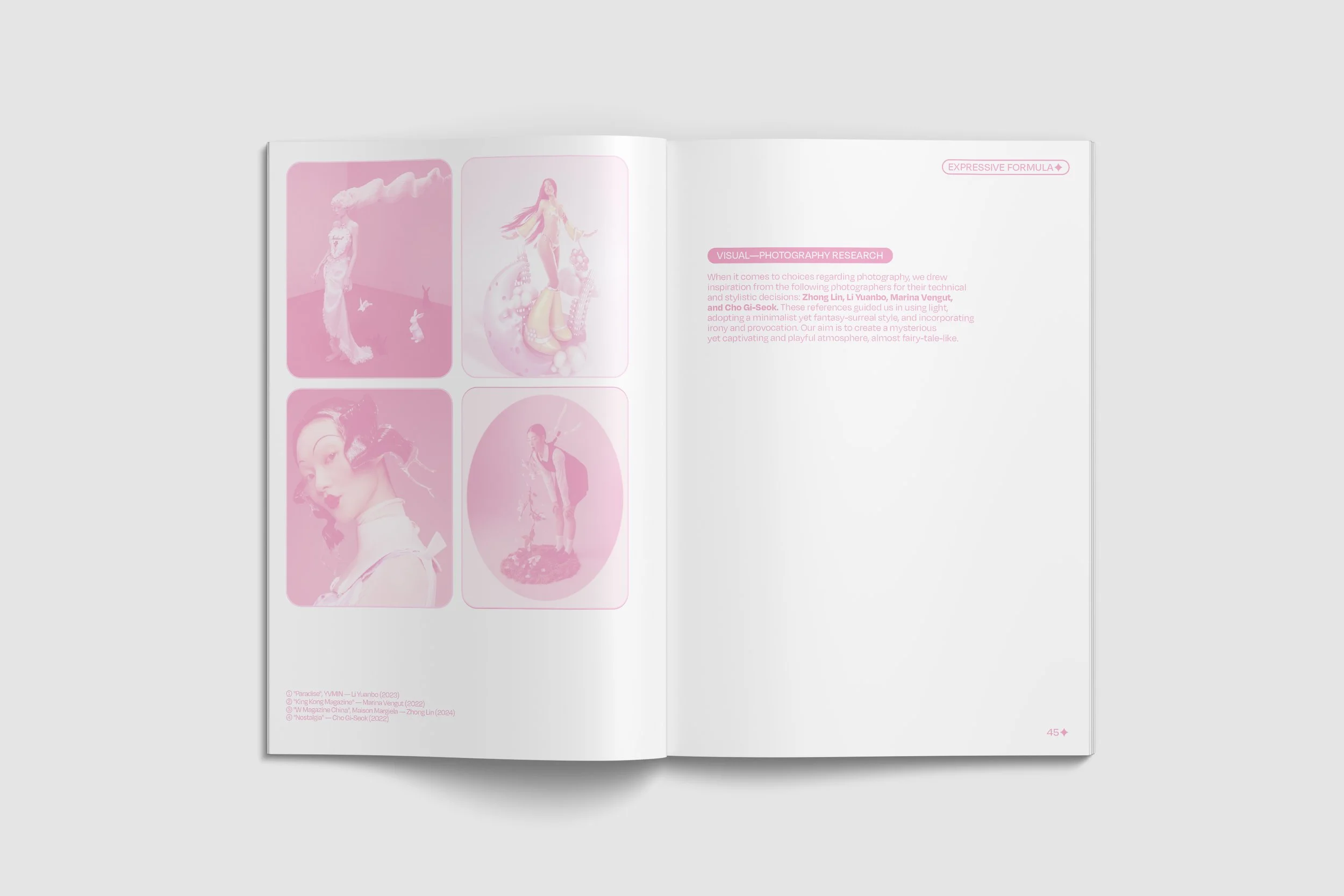
Our expressive guide has enabled us to sharply define our bold stylistic and compositional choices for the project. Regarding tone, we have selected provocative adjectives: disturbing, ironic, exaggerated, and deliberately uncomfortable. The style has been outlined as surreal-fantasy, childlike yet eerie. The space has been envisioned as a utopian dimension. Lastly, the concept of time has been radically reimagined as non-linear.
UTOPIC DIMENSION
The concept of utopia1 has been widely applied since ancient times, but the term itself was coined in the 16th century by English humanist and philosopher Thomas More in his 1516 work, "Utopia." This neologism combines 'ū' (not) and 'tópos' (place), signifying a "place that does not exist," specifically an imaginary island in his novel, representing an idealized, non-existent place.
Society's obsession with "cuteness" reduces women to childlike figures, stripping them of power and autonomy. This exaggerated fixation is a deliberate and perverse exploitation of femininity. While escaping to a utopian dimension where perversion doesn't exist might seem appealing, it is merely an illusion. The real way to combat perversion is to investigate it and educate people about it.
-
The colour palette for our editorial is mainly soft pastels, adding to the cute aesthetic, with inspiration from the japanese kawaii world. Soft pastels evoke feelings of innocence, warmth, and nostalgia, aligning perfectly with the themes of cuteness and childlike wonder. The kawaii culture, renowned for its emphasis on endearing and charming visuals, heavily utilises these hues to create an inviting and delightful atmosphere. By incorporating these colours, we aim to visually represent the essence of kawaii, reinforcing the editorial's exploration of how cuteness can both enchant and obscure deeper societal issues.
-
For this editorial, we have created an avatar that serves as the representative symbol—or 'mascot'—of our concept. Named Lolipuff, derived from "Loli" and "Jigglypuff," our avatar is pink, cute, and playful. It takes the form of a bunny and is customized into seven unique emoji expressions, each conveying a feeling
of warmth and cuteness. Our mascot comes to life through stickers that become moments of play and sharing.
-
We selected three main symbols for each shot to establish a clear narrative structure. Each symbol is represented by a stuffed animal toy, each one symbolizing a distinct emotion we aim to convey. The three symbolic protagonists in our project are: a bunny, a fawn, and an octopus.
The Bunny has two connotations. One is that of Playboy. The Playboy bunny logo, with its iconic bow tie, represents a very different connotation. Here, the rabbit is a symbol of luxury, lifestyle, and sexuality. Hugh Hefner chose it because rabbits are known for their playful nature and high fertility, with an undertone of sexual energy and promiscuity. On one hand, it maintains an appearance of playful innocence (the rabbit as a cute and friendly animal), but on the other hand, it is loaded with adult and sexual meaning, evoking the idea of seduction and sexual allure. In this way, it conveys an uncomfortable and mysterious feeling to the viewer.
The Bambi represents the archetype of innocence and childhood vulnerability. The character of Bambi evokes a sense of tenderness and protection, being a fawn facing the challenges of wildlife. Bambi's cuteness is a way to express and awaken deep emotions such as compassion and empathy, reflecting a phase of life characterised by purity and growth. By bringing an element of innocence into the scene, we confuse the viewer by juxtaposing it with sexual symbols placed around it, thus, achieving to criticise the absurdity of infantilization.
The Octopus is a symbol of manipulation and perversion. Its tentacles represent the ability to envelop and suffocate, reflecting a pervasive and oppressive grip. It is also a sensual and mysterious creature of the deep. In Greek mythology, octopuses were linked to the Goddess Mother and were a personification of Aphrodite. Moreover, in Japan the octopus is considered a sex symbol that makes amorous advances to eight diving maidens with each of its tentacles. Once again, with symbolic ambiguity, we aim to daze the viewer and recreate discomfort from perversion.
-
The creative book for this project perfectly embodies the essence of Lolipuff. Using a playful and cute tone, it critiques sexual infantilization while providing an engaging narrative of our journey and the project's evolution. This volume represents a voyage through the key milestones and transformations that have defined Lolipuff, inviting readers to reflect with lightness and irony on the themes addressed.
-
Critique of sexual infantilization.
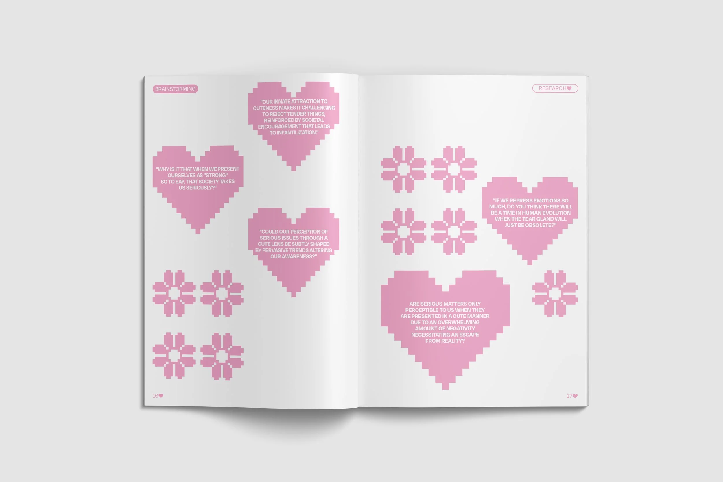
Our project aims to critique sexual infantilization, particularly of women, and how society masks this perversion under the guise of “cuteness”.
By examining how cuteness can be used to conceal serious issues and perpetuate power imbalances, we seek to uncover the complex dynamics at play in our cultural and psychological interactions with the concept of “cute”.
This exploration challenges social norms and underscores the need for a deeper understanding of how seemingly innocent attributes can be manipulated to uphold harmful stereotypes and control mechanisms.
Through this critical lens, we aspire to promote awareness and foster a more equitable cultural discourse.
-
“Lolipuff” is a neologism is a whimsical blend inspired by the concept of “lolicon” or “lolita complex 2” and the beloved Pokémon Jigglypuff, known for its round, pink, and irresistibly cute appearance. With this name, we wanted to create a recognizable term that encapsulates both the allure and controversy surrounding the “lolicon” culture while juxtaposing it with the innocent, charming image of Jigglypuff. This fusion aims to provoke thought and discussion about the complex interplay between innocence and eroticism in popular culture, as well as the ways in which cuteness can be both enchanting and problematic. By coining “Lolipuff”, we highlight the dual nature of cuteness and its implications in society.
-
"Cute is an infantilizing fixation that seeks to exploit the perverse." With this insight, we aim to dissect the implications of infantilization, particularly its intersections with sexual perversion. Is cuteness merely an aesthetic pleasure, or does it trivialise and obscure harsh realities?
We scrutinise cuteness in all its forms—be it aesthetically, subjectively, psychologically, and through a feminist lens. Our critique centers on the sexual infantilization of women and how society cloaks this perversion under the guise of cuteness. We reveal how cuteness can obscure serious problems and perpetuate power imbalances.
Join us in unmasking the cute, exposing its role in perpetuating sexual infantilization, and advocating for a more conscious and balanced representation of femininity in media and culture.”
-
Our fashion editorial is showcased through a set of cards inspired by pokemon cards and cute symbolisms. Each card has its own symbol that are also included in our props selection: The Bunny, The Bambi and The Octopus. Through these animals, we imitate the pokemon cards to emphasise on the cuteness and innocence of a card game. We want the viewer, customer, to reminisce the times of materialistic exchange. As kids, we didn’t have a way of showing power to one another, but our role models did with money. And so, cards is a means of exchange, it is a symbol of power dynamics and society structures. By integrating these symbols into our editorial, we highlight how seemingly innocent objects can carry deeper meanings related to societal influences and power. The choice of animals reflects innocence and charm, while the concept of trading cards as a medium of exchange draws a parallel to how value and power are assigned in society. This approach not only evokes nostalgia but also prompts the viewer to reflect on the underlying social constructs that shape perceptions of value and authority, bridging the gap between childhood memories and adult realities.
-
We decided to experiment with typography by combining different styles for our project. We chose five distinct fonts: Cormorant Infant, to evoke a sense of "cuteness"; Degular, to ensure uniformity and fluidity throughout; P22 Albemarle Pro, for a fairy-tale touch with its elegant and baroque style; Jacquarda Bastarda 9, to evoke the world of kawaii with its geometric design; and finally Yarndings 20, a symbolic font that reflects our character's language.
When it comes to the graphic style of our project, we decided to infuse it with a fairy-tale and playful tone that evokes the world of cuteness and childhood. Therefore, we chose to play with typography and graphic effects. Additionally, we enriched the graphic design with the use of gradients, stickers, and graphical elements. The graphic style blends a vintage 90s aesthetic with a modern and contemporary approach.